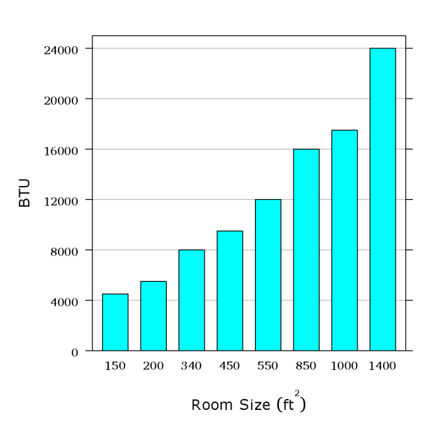
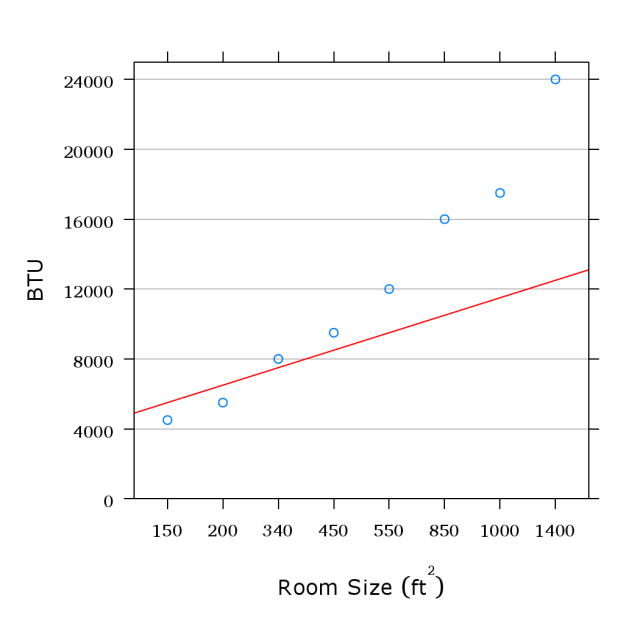
Everyone knows the basics for most plots. Find the data you have and follow lines to
find the result. But what about points in between?
The text’s Figure 10. So 850 square feet
needs a 16 000 BTU air conditioner.
-
What
if
you
have
a
900
square
foot
area?
Might
look
between
nearby
points.
-
Or
a
100
square
foot
area?
Only
one
nearby
point.
Is there a relationship you can use?
(Text figure’s source: Carey, Morris, and James. Home
Improvement for Dummies, IDG Books.)
|
__________________________________________________________________
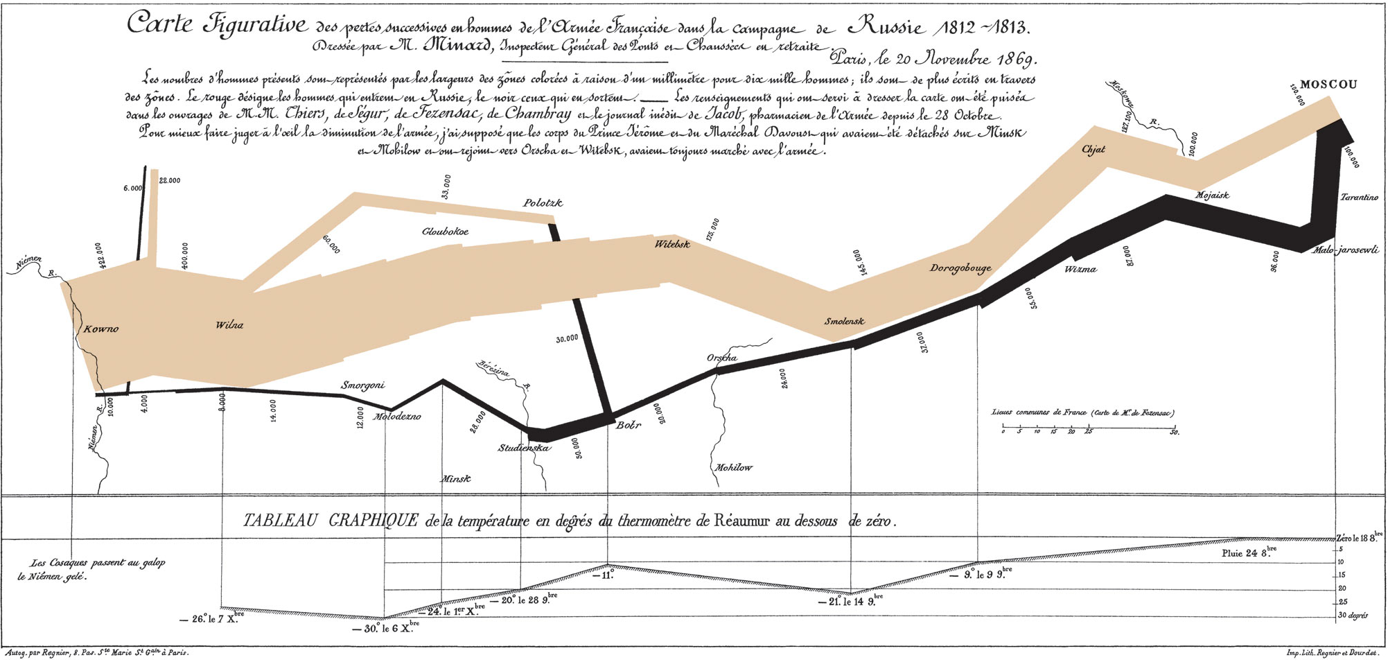
-
A
first
thought
is
to
use
a
line.
-
People
often
build
items
to
fit
lines;
it’s
how
we
tend
to
think.
-
But
the
relationship
here
doesn’t
look
like
a
line,
does
it?
|
________________________________________
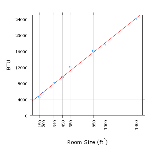
- As a first step, get rid of the
bars.
-
The
areas
have
no
meaning.
-
But
they
aren’t
bad
here,
more
on
that
later.
- We haven’t changed the data, so
this still does not appear to be a
line.
|
_______________________________________
-
Trying
a
statistical
line
fit:
Definitely
no
line
here.
-
But
look
at
the
x
axis.
-
Are
the
points
spaced
appropriately?
|
__________________________________________________________________
- Spread the points out, and
suddenly we do have a line.
-
The
BTU
measurements
likely
are
rounded,
so
not
a
perfect
line.
- Now we can predict the BTUs
needed for any size without
having to poke at nearby points
and estimate differences.
|
______________________
The points:
-
Bar
charts
like
these
often
are
tables
and
not
graphs.
-
Inductive
reasoning:
Keep
track
of
your
assumptions
when
extrapolating
visual
relationships.
|
__________________________________________________________________
-
Remember
in
the
bar
chart:
Areas
did
not
matter.
-
People
are
very,
very
bad
at
judging
areas.
-
Given
the
one
baloon
represents
12%,
how
large
is
the
one
next
to
it?
(From the Onion (//www.theonion.com:http://www.theonion.com))
|
__________________________________________________________________
-
Given
the
one
baloon
represents
12%,
how
large
is
the
one
next
to
it?
-
22%
-
This
is
the
Onion,
but
the
graph
is
to
scale.
-
Not
by
area,
but
by
length.
-
But
you
see
area
first\mathop{\mathop{…}}
(From the Onion (//www.theonion.com:http://www.theonion.com))
|
__________________________________________________________________
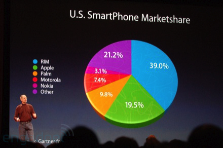
- Also beware graphs with too
much of a “slant”.
- In a “pie chart”, areas are the
data.
- But people are very, very bad at
judging areas.
- Which is larger, 19.5% or
21.2%?
- Who is the 19.5% in this image?
- Avoid 3D effects!
(at Macworld 2008, photo from Ryan Block of Engadget
(//www.engardget.com:http://www.engardget.com)) |
____________________________________________________
| Vendor | US market share (%) |
| RIM | 39.0 |
| Apple | 19.5 |
| Palm | 9.8 |
| Motorola | 7.4 |
| Nokia | 3.1 |
| other | 21.2 |
| |
|
-
Never
be
afraid
of
using
small
tables.
-
Is
there
a
problem
with
other
being
the
second
largest?
-
other:
LG,
Samsung,
Ericsson,
\mathop{\mathop{…}}
- Knowing your premises:
- US-only.
-
Nokia
is
#1
world-wide
(40%)
-
Samsung
is
#2
(15%)
-
Motorola
is
#3
(10%)
- No history in this table, no
idea about future.
|
__________________________________________________________________
Will walk through some of my thoughts while creating graphics for a highly technical
paper.
____________________________________________________________
-
Purpose:
Display
all
our
experimental
data
without
much
interpretation.
-
Too
much
data
for
a
simple
table?
-
On
the
left:
algorithms
and
data
cases
(plain
v.
exceptional)
-
Blocks:
Specific
processors
-
Below:
CPU/processor
cycles
per
array
entry
-
Dotted
vert.
line:
CPU
cycles
for
a
critical
operation
-
Colors
and
symbols:
“direction”
of
algorithm
and
data
cases
(repeated!)
-
Graph
allows
simple
comparisons
of
our
raw
data.
(from Marques, Riedy, and Vömel. Benefits of IEEE-754
features in modern symmetric tridiagonal eigensolvers)
|
__________________________________________________________________
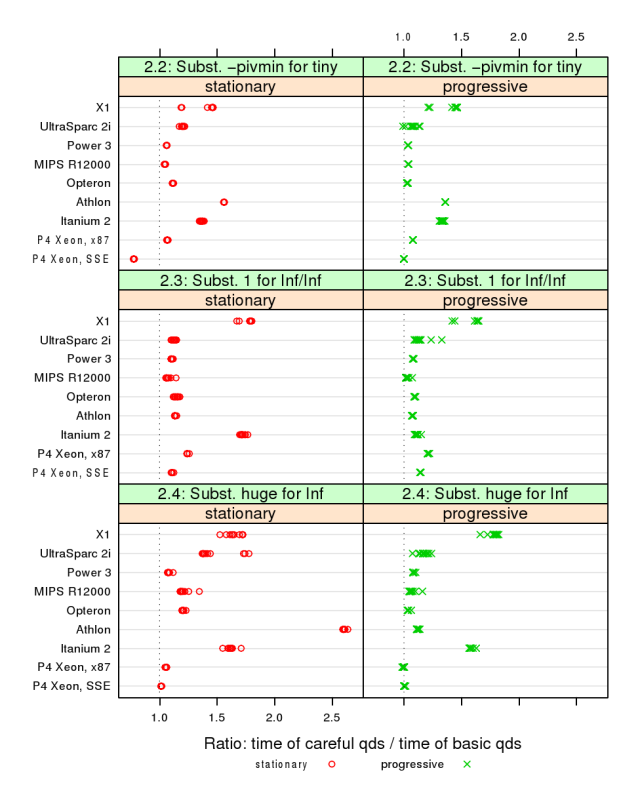
-
Purpose:
Determine
if
CPUs
impose
penalties
on
certain
arithmetic
features.
-
Each
algorithm
(green
bars)
uses
a
different
feature.
-
Ratio
of
“careful”
over
“plain”
shows
a
slow-down.
- Find outliers by looking down
and across:
-
One
direction
(“progressive”)
encounters
more
problems
than
the
other
(“stationary”)?
-
Missing
data
here:
“stationary”
ran
far
more
slowly,
slow-down
hidden
by
total
cost.
(from Marques, Riedy, and Vömel. Benefits of IEEE-754
features in modern symmetric tridiagonal eigensolvers)
|
__________________________________________________________________
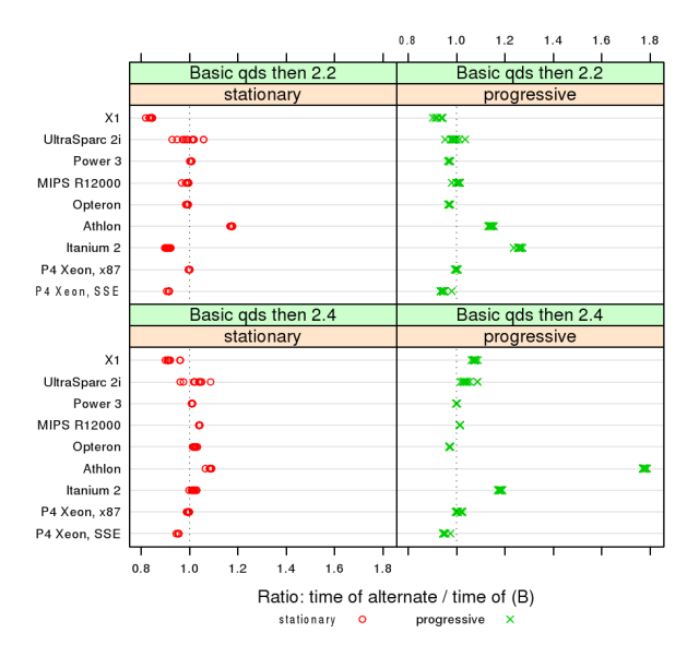
-
Purpose:
Begin
interpreting
the
data
to
determine
which
single
algorithm
should
be
used.
- Chose one algorithm, “B”, to
normalize others (2.2, 2.4).
-
Reviewers
(and
authors)
missed
a
typo.
“B”
should
be
2.3.
- Could this have been a table?
-
More
than
a
page
of
data
in
tabular
form.
-
Can
be
summarized
by
statistics
(median
and
percentiles).
-
Summaries
were
in
the
text.
- Does this serve its purpose?
-
With
hindsight,
not
really.
-
Summary
in
the
text
was
better.
-
This
plot
was
unnecessary.
(from Marques, Riedy, and Vömel. Benefits of IEEE-754
features in modern symmetric tridiagonal eigensolvers)
|
__________________________________________________________________